Automobile Sales during Recession
python
%pip install pandas
%pip install numpy
%pip install seaborn
%pip install folium

import numpy as np
import pandas as pd
%matplotlib inline
import matplotlib as mpl
import matplotlib.pyplot as plt
import seaborn as sns
import folium
python
URL = "https://cf-courses-data.s3.us.cloud-object-storage.appdomain.cloud/IBMDeveloperSkillsNetwork-DV0101EN-SkillsNetwork/Data%20Files/historical_automobile_sales.csv"
df = pd.read_csv(URL)
 1 / 13
python
Sales_over_year = df.groupby('Year') ['Automobile_Sales'].mean()
Sales_over_year = Sales_over_year.reset_index()
Sales_over_year.head()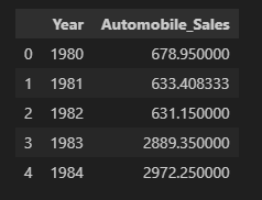 2 / 13
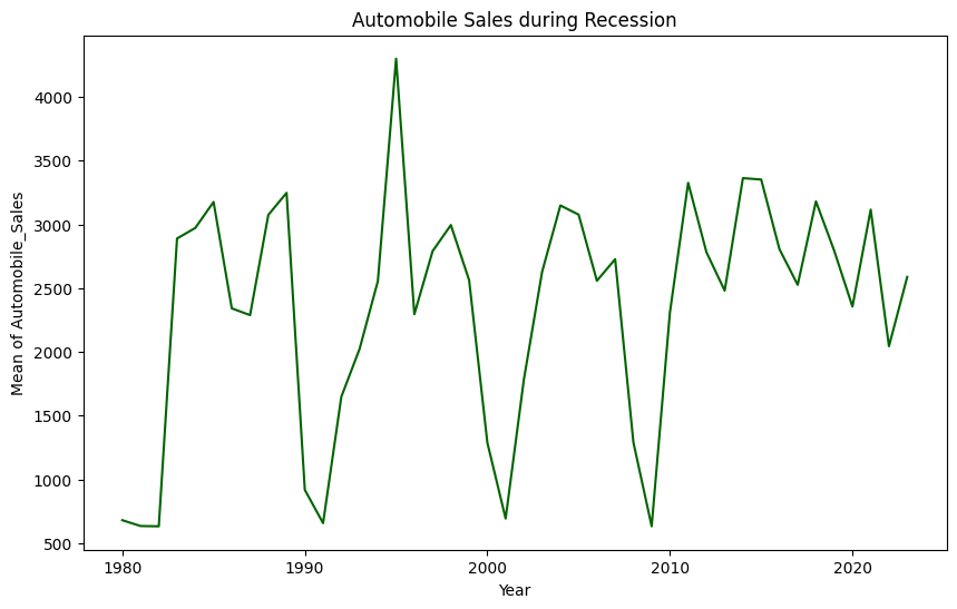 3 / 13
python
plt.text(2007,2009, 'house market crash')
plt.text(2020,2020, 'covid-19 crash')
years = range(1980,2023)
plt.xticks(years,rotation = 55)
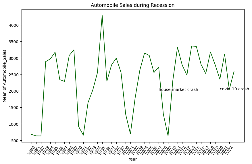 4 / 13
---
python
#Keep only recesion data
df_rec = df[df['Recession'] == 1]
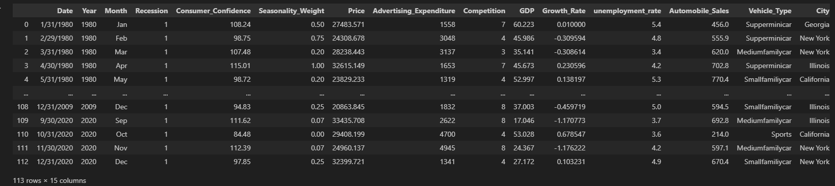 5 / 13
python
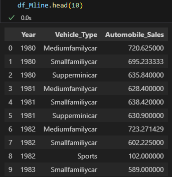
df_Mline = df_rec.groupby(['Year','Vehicle_Type'],as_index = False ) ['Automobile_Sales'].mean()
 6 / 13
python
df_Mline['Normalized Sales']  = df_Mline.groupby('Vehicle_Type')['Automobile_Sales'].transform(lambda x: x / x.mean())
df_Mline.set_index('Year', inplace=True)
python
# Highlight recession years
recession_years = df_rec['Year'].unique()
for year in recession_years:
    plt.axvline(x=year, color='gray', linestyle='--', alpha=0.5)

# Add labels, legend, and title
plt.legend(title="Vehicle Type", bbox_to_anchor=(1.05, 1), loc='upper left')
plt.ylabel("Normalized Sales")
plt.xlabel("Year")
plt.title("Normalized Automobile Sales by Vehicle Type During Recession")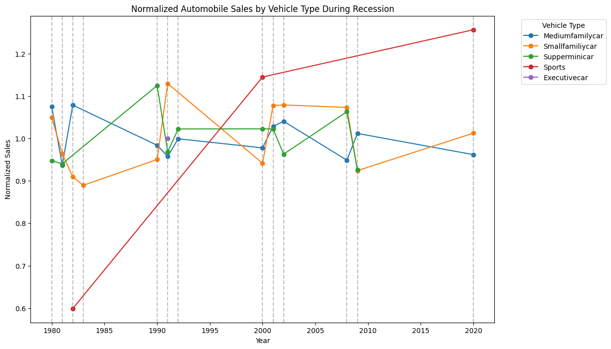 7 / 13
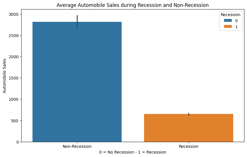
Average number of vehicles sold during recession and non-recession periods
python
new_df = df.groupby('Recession') ['Automobile_Sales'].mean().reset_index()

plt.figure(figsize=(10,6))
sns.barplot(x='Recession',y='Automobile_Sales',hue = 'Recession',data=df)
plt.xlabel('0 = No Recession - 1 = Recession')
plt.ylabel('Automobile Sales')
plt.title('Average Automobile Sales during Recession and Non-Recession')
plt.xticks(ticks=[0, 1], labels=['Non-Recession', 'Recession'])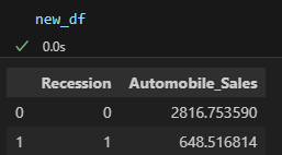 8 / 13
 9 / 13
**Variations of GDP during recession and non-recession period**
python
###Create dataframes for recession and non-recession period

rec_data = df[df['Recession'] == 1]
non_rec_data = df[df['Recession'] == 0]
#Figures
fig=plt.figure(figsize=(12, 6))

#Create different axes for subploting
ax0 = fig.add_subplot(1, 2, 1) # add subplot 1
ax1 = fig.add_subplot(1,2,2) # add subplot 2 .

#subplot 1
sns.lineplot(x='Year', y='GDP', data=rec_data, label='Recession', ax=ax0)
ax0.set_xlabel('Year')
ax0.set_ylabel('GDP')
ax0.set_title('GDP Variation during Recession Period')

#subplot 2
sns.lineplot(x='Year', y='GDP', data=non_rec_data, label='Non-Recession',ax=ax1)
ax1.set_xlabel('Year')
ax1.set_ylabel('GDP')
ax1.set_title('GDP Variation during Non-Recession Period')
plt.tight_layout()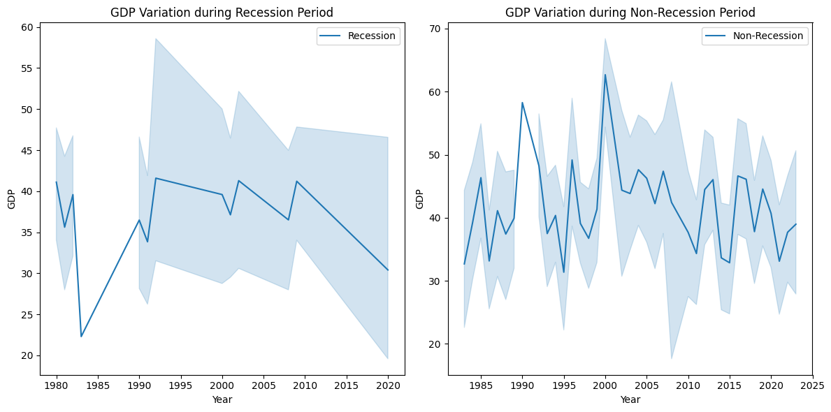 10 / 13
python
non_rec_data = df[df['Recession'] == 0]

size=non_rec_data['Seasonality_Weight'] #for bubble effect

sns.scatterplot(data=non_rec_data, x='Month', y='Automobile_Sales', size=size)

plt.xlabel('Month')
plt.ylabel('Automobile Sales')
plt.title('Seasonality impact on Automobile Sales')

plt.show()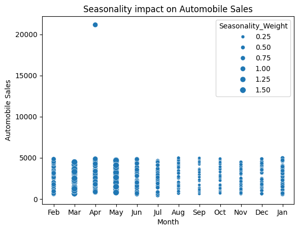 11 / 13
Advertising Expenditure during Recession and Non-Recession Periods
python
# Filter the data
Rdata = df[df['Recession'] == 1]
NRdata = df[df['Recession'] == 0]

# Calculate the total advertising expenditure for both periods
RAtotal = Rdata['Advertising_Expenditure'].sum()
NRtotal = NRdata['Advertising_Expenditure'].sum()

# Create a pie chart for the advertising expenditure
plt.figure(figsize=(8, 6))

labels = ['Recession', 'Non-Recession']
sizes = [RAtotal, NRtotal]
plt.pie(sizes, labels=labels, autopct='%1.1f%%', startangle=90)

plt.title('Advertising Expenditure during Recession and Non-Recession Periods')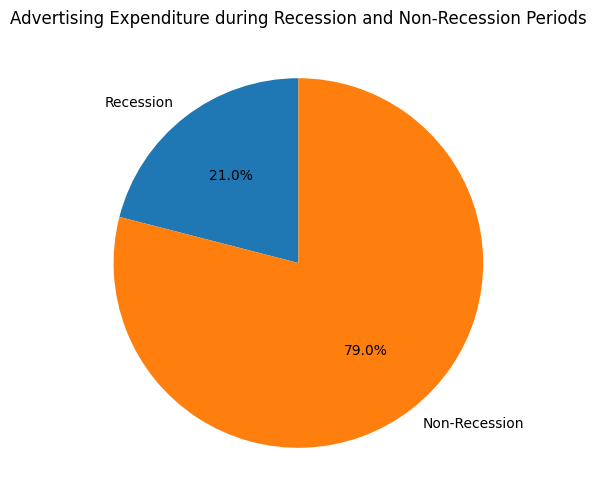 12 / 13
Share of Each Vehicle Type in Total Expenditure during Recessions
python
Rdata = df[df['Recession'] == 1]

# Calculate the sales volume by vehicle type during recessions
VTexpenditure = Rdata.groupby('Vehicle_Type')['Advertising_Expenditure'].sum()

# Create the pie chart
plt.figure(figsize=(10, 6))

labels = VTexpenditure.index
sizes = VTexpenditure.values
plt.pie(sizes, labels=labels, autopct='%1.1f%%', startangle=90)

plt.title('Share of Each Vehicle Type in Total Expenditure during Recessions')

plt.show()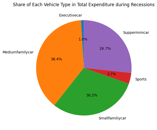 13 / 13